Results
Purpose
The Results section is the most important section of your report because it is where you make a direct scientific contribution. While the interpretation of your results can change as other discoveries are made, carefully collected and accurately analyzed data are a permanent record of what you observed (i.e. what you observed does not change in the light of new interpretation). This is why we distinguish between observations and interpretations by separating the Results section from the Discussion section.
Your job in the results is to present your analyzed data in a manner that directly addresses the purpose you stated in the introduction. Your analysis should clearly draw your reader's attention to the most important trends.
Before you write
Data analysis
Many students make the mistake of not spending enough time on data analysis before they jump into writing the results. Before you can decide how to present the results you must have a clear idea as to what your results actually show.
The approach you will take to analyzing your results will vary depending on the field you are working in and the type of study/experiment you did. However, you will generally need to manipulate your data in some manner. For example, if you conducted an experiment where you did replicate trials of several treatments, you will likely need to calculate means and measure the variability around the mean (e.g. standard deviation or standard error). Usually your instructor will have some tips on how to analyze the data you have collected.
Analysis vs Interpretation
Students frequently get confused as to what belongs in the results and what belongs in the discussion. Part of the confusion stems from the use of the word "interpret" to mean different things in different contexts.
In order to have results to present, you will need to analyze your data. This analysis includes manipulating the data to find trends. It is your job to figure out what your data show, and to make sure the reader can easily follow what you found. Because you are figuring out what the raw data 'means' many sources refer to data analysis as interpreting the data, but it is less confusing to simply call this analyzing the data.
In the discussion, you will explain what the results mean. We often refer to this as interpreting the results, but it distinctly different from analyzing the data. To make it less confusing, think of the discussion as giving MEANING to the results.
To check if a statement belongs in the results or discussion
The statement can be fully supported by the actual data you collected = Results.
The statement includes some speculation or supporting the statement requires using results you did not produce in this study = Discussion.
What to include
Visual summaries
Visual summaries allow you to present your analyzed results in a concise and easy to follow manner. Visual summaries generally take the form of tables or figures. A figure includes any type of visual that is not a table (e.g. a graph or a photo or a model).
Rarely will your visual summary include raw data. If you really think your instructor needs to see the raw data, put in an appendix.
Do I need a table and/or a figure?
Every datum you collect may not need to be in a visual summary.
- If you can easily state the result in words you probably don't need a visual.
You probably need a visual if the answer to either of the following question is yes.
- Does this visual make it easier for me to explain to the reader what I found (i.e. can I use fewer words)?
- Will this visual make it easier for the reader to understand what I found (they can quickly "see" the data that support the claims I have made)?
You can only show analyzed data once so ask yourself
- Is this the best visual to show the reader the most important results (e.g. if you are using a table, would a figure work better, or vice versa)?
Do not include visuals you will not use (i.e. if the visual does not support a statement in the results section).
Choosing a table or a graph
Graphs are best for showing
- trends related to an incremental set of controlled variables (e.g. growth as a function of time, or plant height as a function of increasing hormone treatments) - see the Graph Choice Chart for which type of graph to choose, based on the type of data you have
- relationships between variables where the exact values are less important than the relationship or shape (e.g. comparing bacterial growth curves for two different media)
- trends that are difficult to describe verbally or that would not easily be recognized in a table format
Tables are best for
- showing precise values
- comparing groups using several unrelated variables that could not be easily graphed (e.g. comparing several morphological aspects of 3 frog species)
Verbalizing the results
It is not enough to simply put some tables and figures into the results section. You need to use SENTENCES to tell the story of your results. In the results section, your goal is to clearly highlight the important trends. For example, don't simply describe the visual in words, instead use the visual to back up a statement.
What are the important trends?
The important trends will include those that directly relate to the study's purpose. If your purpose was to answer a particular question, the important trends should answer that question. If you set out to test a hypothesis, the important trends should support or refute the hypothesis.
Important trends will also include any unexpected results or results that differ from previously published results. You will need to point these out because you will want to address them in the discussion.
Strategy
- Start by outlining the important trends in the results and think about how best to communicate these trends to your reader. If you think you need a visual, sketch out what that visual will show.
- Check to make sure that the trends you are focussing on are helping you address the goals of your study.
- Note any interesting or unexpected results that will need to be discussed.
- Once you are clear on what you want to say and what the figures or tables should show, create your visuals.
- Organize the results logically, for example, chronologically, or from most important to least important.
Preparing figures and tables
- Figures and tables can take a fair amount of time to put together, so make sure you are only preparing figures and tables that you really need.
- Keep figures and tables as simple as possible. If a visual is getting complicated, you may need to split it into two visuals.
- Figures and tables must be self-contained; that is the reader should be able to interpret the figure without reading any other part of the paper. This means that if a reader looks only at a figure/table and its associated legend/heading, they should be able to fully understand the key results summarized in the figure, how the data was generated and why the result is important. Example of a self-contained figure.
- Some instructors require figures and tables to be included inline with your text. Others will ask that you put them all at the end of the report (after the citations but before any appendices). Others won't care either way. Make sure you know what is required for your particular course.
- If you are including your visuals in the results section, make sure they are introduced before they appear. It doesn't make sense so show a table to the reader before you have told them to look at it.
Please note that there are too many types of figures and tables for us to cover them all. We will give you some generic tips. Make sure you investigate the best ways to handle the particular visual you are using.
Figure How To
Figures are any visuals that are not tables. All figures are labeled sequentially as "Figure #". Stick with whole numbers for your figure labels, unless you have been told otherwise (i.e. the first figure is Figure 1, the next figure is Figure 2).
- Figure legends usually appear below the figure and are labeled sequentially, starting with Figure 1.
Graphs and Charts
- If you are using Excel to create your graphs keep in mind that Excel's default style is not usually appropriate for biology. You are expected to make the graph look professional to other biologists. Lauri's Excel tutorials.
- Graphs and charts must have clearly labeled axes. Make the labels descriptive and remember to include units if appropriate.
- The independent variable (what you controlled) is always on the x-axis, and the dependent variable (what you measured) is on the y-axis.
- Do not put a title above the chart as the title is in the figure legend.
- Choose axis scales such that the data points are not squished to one side of the graph.
- Choose tick mark intervals that make the results easy to follow; too many are distracting, to few makes it hard to determine data point values.
- Don't use gridlines and don't shade the graph area (Excel frequently does this by default).
- Choose simple symbols that are easy to tell apart (circles, squares, triangles). Do not rely on colour to differentiate symbols as papers are usually printed in black and white.
- Clearly indicate the meaning of all symbols. You may include a legend on the chart if appropriate, or you may just explain the symbols in the figure legend.
- Be consistent with symbols, line styles, and colour schemes.
- Be consistent with numbers and units within and between figures (e.g. don't show some masses in grams and others in kilograms - use scientific notation as needed).
- Connect points in a series if needed to emphasize a trend or to make it easier to differentiate between multiple series. Be careful when applying smooth curves as this is a type of modeling that may not be appropriate for your results.
- If your data points are means, you may need to include error bars above and below the points.
See figure examples below.
Table How To
- Table titles usually appear above the table, and are labeled sequentially starting with Table 1.
- Only the first word in the table heading has a capital letter.
- The table title must be descriptive and brief. In some cases, a single phrase will work.
- If the table title is a single descriptive phrase, it does not have a period.
- If the table title is longer (more than one sentence) punctuate appropriately.
- The independent variable is usually presented vertically in the first column
- Data related to each independent variable are presented horizontally, in the same row as the independent variable.
- Like elements read downwards.
- All columns must have brief but informative labels (headers). Include units for any measurements.
- Align all the decimal points in each column.
- Data to be compared should be in adjacent columns.
- To keep the table clean and easily readable, put important supporting information in footnotes below the table.
- Make sure your table "looks good". Only use as many borders as is necessary to make the table easy to read (by default Word puts borders around every cell).

Examples
Figure examples
Default Excel chart
There are many problems with this chart, keep scrolling to see what needs to be fixed.
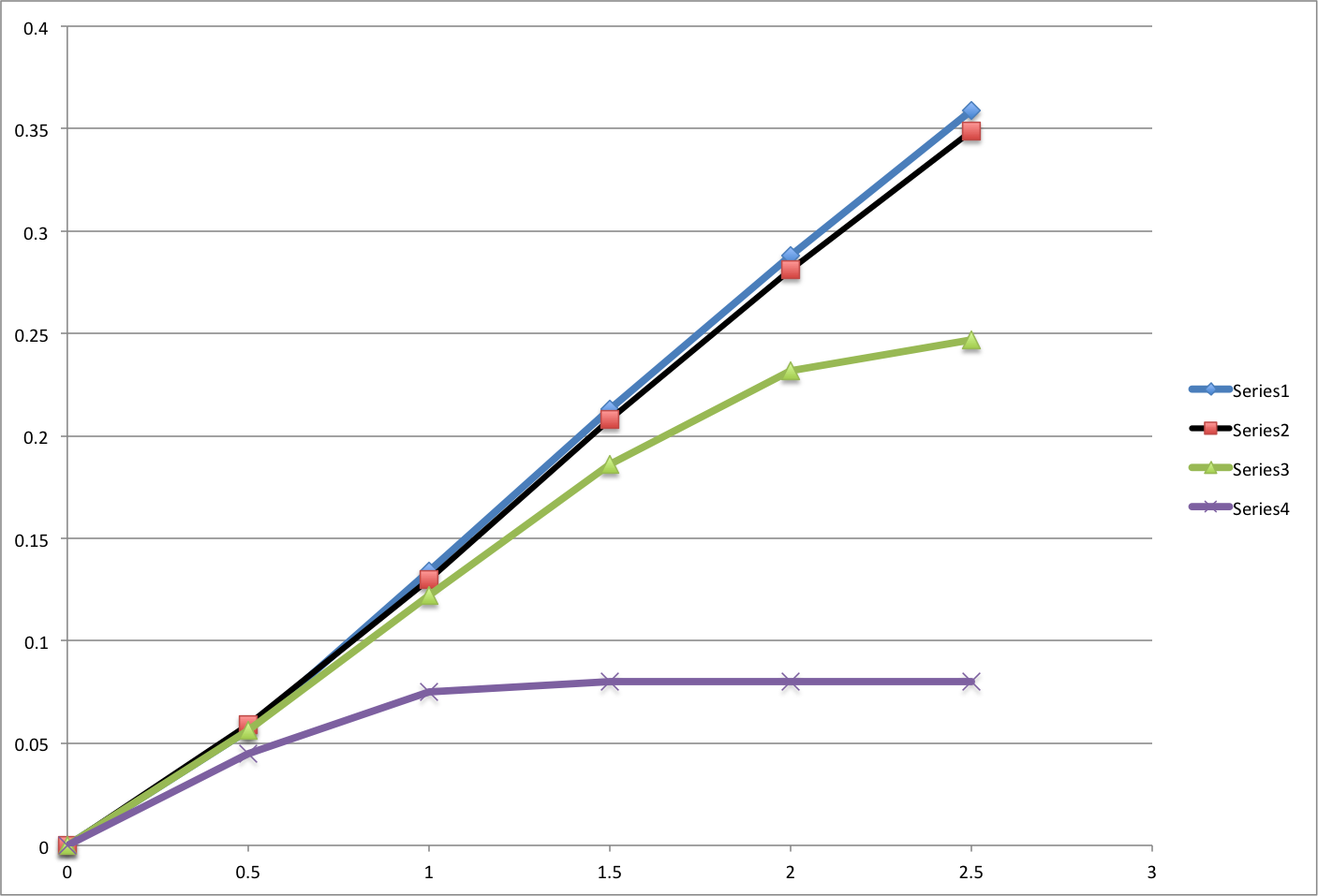
What needs to be fixed?
- Generally colour should be avoided as most journals do not publish colour figures unless absolutely necessary.
- By default Excel adds gridlines to charts. These are unnecessary and clutter the chart making it harder to see the important line.
- The labels “series 1, 2, 3, 4” are useless and must be replaced with informative labels; however, it is also okay (and sometimes preferred) to define symbols in the figure legend.
- Excel generally does not know what to label your axes. Make sure to label your axes and indicate units.
- For this example, Excel did an okay job of picking most symbols, setting the axes tick marks and setting the min/max values for the axes but frequently you will need to manually change these.
- This is not a self-contained figure. A figure legend must be added.
- NOTE: DO NOT add a title to this chart because the title will be part of the figure legend.
Figure after being fixed

How is this a self-contained figure?
As noted above, all figures must be self-contained. I.e., if a reader looks only at a figure and its associated legend, they should be able to fully understand three things. This figure addresses all three aspects as summarized below.
-
Why is the result important (or what question does the figure address)?
What is the effect of substrate concentration on the time needed to reach equilibrium in IDH catalyzed NADPH production? (In this example, this is spelled out in the figure legend.) -
What is the key result summarized in the figure?
Adding more substrate results in the reaction taking more time to reach equilibrium. (This can be seen by looking at both the figure legend and the chart. The plateau in absorbance happens sooner when starting with lower substrate concentrations (the figure legend indicates that each line is a different substrate concentration - the lowest was 0.5 mM and it reached a plateau in the shortest amount of time).) -
How was the result obtained?
Different amount of isocitrate were added (Spelled out in the figure legend.) and the time needed to reach equilibrium was measured by tracking the accumulation of NADPH (in figure legend) over time using a spectrophotometer set to 340 nm. (Figure legend and axis labels.)
Verbalizing important trends
Genetics Example:
In my introduction, I stated, "I determined if fruit-fly mating frequency was influenced by different types of music."
Poor trend description
Fruit flies mated 3 times per h when exposed to classical music and mated 5 times per h when exposed to rap music.
This is a poor trend description because I am expecting the reader to do the actual comparison.
Better trend description
Fruit flies mated more frequently when exposed to rap music rather than classical music. OR Fruit flies mated almost twice as often when exposed to rap music compared to classical music.
Microbiology Example 1:
In the introduction, I predicted, "more normal flora bacteria would be found in moist locations like the throat than in dry locations like the forearm".
Poor trend description
Table 2 shows that I found 2000 colonies on agar plates inoculated with a throat sample, but only 10 colonies for a forearm sample and 20 colonies for a neck sample.
Better trend description
Throat samples yielded 100 to 200 times more colonies than forearm or neck samples (Table 2).
Microbiology Example 2:
My stated purpose was "to determine the best growth conditions for Escherichia coli by measuring the lag time under various growth conditions".
Poor trend description
In Figure 2 you can see that when grown in Tryptic Soy broth, the lag time for E. coli growth was 6 h using a 3 day-old starter and 2 h when using a 1 day-old starter. When grown in Brain-Heart Infusion broth, Figure 3 shows that the lag time was 9 h for a 3 day-old starter and 1 h for a 1 day-old starter culture.
Here I have not described a trend at all, but I am really just restating the figure. Instead, make actual comparisons and back them up by referring to the figures parenthetically.
Better trend description
In Tryptic Soy broth, the lag time for E. coli growth was three times longer when a 3 day-old starter culture was used than when a 1 day-old starter culture was used (Figure 2). This effect was even more pronounced when Escherichia coli was grown in Brain-Heart Infusion broth (Figure 3).
This is better because I am actually making comparisons that allow the reader to 'get' that I found shorter lag times with the 1 day-old culture.
Even better
The shortest lag times were observed when 1 day-old starter cultures were used. For example, in Tryptic Soy broth, the lag time for E. coli growth was three times longer than when a 3 day-old starter culture was used than when a 1 day-old starter culture was used (Figure 2). This effect was even more pronounced when E. coli was grown in Brain-Heart Infusion broth (Figure 3).
This is even better because I am clear about what conditions produced the shortest lag times. This statement belongs in the results because I can completely back it up with the data I produced in this study.